Major: Pop-up Redesigns
I went back and remodeled some of the pop ups for my animation. This was to make them easier to read along with keeping in the with wooden cut out designs. I've also did some small edits to some of them that I didn't need to be completely rework.
 |
| Corn pop-up |
 |
| Farmer pop-up |
 |
| Can't sleep pop-up |
 |
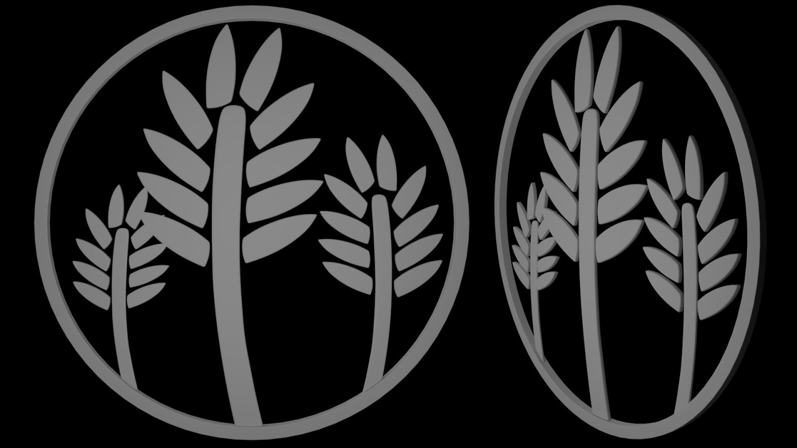
| Grass pop-up |
 |
| Lovers pop-up |
 |
| Sleep pop-up |
 |
| Travellers pop-up |
 |
| Wave pop-up |

Evening Rhia - I still think there will be readability issues with 'Can't sleep' - maybe make it a Roman numeral clock-face instead...
ReplyDeletehttps://www.homedepot.com/p/Designer-Stencils-Large-Roman-Numeral-18-in-Clockface-Wall-Stencil-3700H/305224564
and include - as part of the pop-up's design - a set of hands that are animated to go round and round?
Also why not use a decorative compass instead of the map, thus using the circle more?
Thanks Phil,
DeleteI did think Travellers didn't look right after I had finished it but can't think of anything else that could have symbolized it.