Posts

Showing posts from October, 2016

What If Metropolis - Thumbnail sketches 1 - 9

Image

Maya Tutorial - One, Two, Three Point Lighting

Image
One point lighting Two point lighting Three point lighting

Life Drawing - Day 6

Image
Life drawing was a Halloween special with the main focus being the shadows and silhouette that was being cast by the model as the projector played The Cabinet of Dr. Caligari (1920) over them. The model was also dressed up to keep within the Halloween theme. First time using ink

Maya Tutorial - Batch Rendering

Image

Photoshop Tutorial - Sketching Thumbnail

Image
To get us ready for our next project we were set with the task of combining an animal with an everyday object. This was to get us into the mind set of doing research so that we could create a better set of ideas that we could work from. Animal: Sloth Object: Wardrobe 

Film Review - Alien

Image
Fig 1. Alien poster (1979) Ridley Scott’s Alien (1979) is a basic example of all the key elements that are needed in creating a horror film making the audience believe that they themselves are trapped, along with the main characters, with the creature that is trying to kill them. This is achieved by playing on some of the basic fears people have most notably the fear the unknown and claustrophobia as well as fears that are not noticeable the first time you watch the film. Before the main action of the film starts the audience are shown the interior of the main ship, Nostromo, and it heavily contrasts the exterior that was previously shown in the shots beforehand, the corridors are long and narrow as well as been almost impossible to make out what is at the end. “The corridors are gloomy and labyrinthine, representing a technological version of the subterranean tunnels of gothic horror. Of course, a space ship is the perfect location for a horror film because it is a place of a

Life Drawing - Day 5

Image
Starting to use colour in life drawing to show the light and darker parts of the body. Face studies

Invisible Cities - Reflective Statement

The Invisible Cities project has taught me a lot about what is expected on this course as well as introducing me to the very basics of the software that I will be using throughout the next 3 years. I felt that I started off rather well with this project but became a little over whelmed with trying to balance all of the work that I had been given from the different lessons. I felt that my main strength in this project was my research into the design ideas that I could use for the main look of my chosen city. I already had a strong understanding of how research can help with a project so I found it easy to sail through this part with ease, even if my ideas for my chosen city did change half way through the project. I find it easy to visualise in my head what I felt the city could look like and could think of strong references that I could use to help me improve them or to go back to if I wasn’t able to find a way to get out of a problem. I did find that I had a lot of weaknesses in

'Art of' presentation

'Art of' presentation for Invisible Cities project by Rhia Crouch on Scribd

Crit Presentation

Final Crit Presentation by Rhia Crouch on Scribd

Exterior Low Angle Shot - Finished

Image

Exterior Establishing Shot - Finished

Image

Interior Establishing Shot - Finished

Image

Photoshop tutorial - Showing distance

Image
To show distance in an image pale colours are used in the badground as objects that are far away become blurred and darker colours are used in the foreground as objects are seen as being more focused.

Photoshop tutorial - Gradient

Image
I can not get the hand of this. I understand how using the gradient in Photoshop can help to add colour to a black and white image but it doesn't seen to work with my style of painting.

Contextual studies - Lesson 4

In contextual studies we started to think about what influences our own work and what has influenced others in the past be it their childhood, historical events, fears, dreams or other cultures. One thing that we came across is that animators are influenced by abstract paintings as these are not bound by reality. This helped us to think about how we would look at our chosen film or CAA product for our essay as this will be something that we will have to focus on.

Film Review - 2001: A Space Odyssey

Image
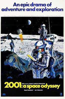
Fig 1. 2001: A Space Odyssey Poster (1968) 2001: A Space Odyssey (1968) is one of the many classics brought to life by Stanley Kubrick. The film stands out in the world of cinema nowadays for the way it was produced but at the time of its release it didn’t receive that many good reviews from the critics, however, it inspired future film makers such as Steven Spielberg and Ridley Scott. Like with most of his films Kubrick frames or centres most of the shots using the rule of thirds a technique that he learned from his days as a photojournalist for Look magazine. As shown in Fig 2 the rule of thirds involves placing a 3x3 grid over the image and lining up the key subjects within it so that everything is not cluttered on one side, in Kubrick’s case he places key subjects in the middle of the grid with other subjects on both sides of it so that the audience’s eye is drawn to what is being shown in the middle. As show in the example Dave Bowman and Frank Poole are on ever

Maya Tutorial - Blocks

Image

Maya Tutorial - Playing with light

Image

Creating an animated gif

Image
Making an animated gif in Photoshop is a lot easier than it sounds just one thing to keep in mind is to work in layers so that you can show your work in progress. When you have the right layers showing you need to create another layer and then go to Image  and then Apply Image . This will create a copy of all the showing layers on the new layer. When you have all of the layers showing you work in progress save your work and then delete the layers you have been working on so that you don't get confused. After this you need to go to Window and Timeline.