Minor: Moon Crown Changes
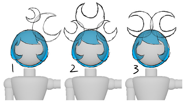
After I had created my characters in 3D with some basic shapes some design problems started to be come noticeable that I couldn't see when drawing them out. One of them was Moon's crown, it was designed to look like two crescent moons sitting on each side of her head but from the front they appeared to look like horns.
I decided to think about redesigning the crown so that it looks more like its intended shape. While I was thinking about making them bigger (after looking at the work by Erte) and moving the crown to sit at the back of the head, I found myself also thinking about if the design should reflect the Moon's gentle personalty or not.
1 - This one I feel has something going for it but I can't see this in the animation as it is a bit too high and might be distracting.
2 - This one is currently my favourite design out the 5. If I use this one I might drop it down abit and move the smaller moons so that they are pointing outwards more. Also, if I use this one I might have to redesign Sun's crown too as this would out shine it.
3 - This also seems to have its good and bad points but I do feel that it might end up having the same problems as the orginal idea and looking like horns.
4 - This design is one of my lest favourites as I can't see it working on the character as a whole. However, I do feel that it might help with the other designs if I need to move things about but I do like the idea of having a smaller disk with the moon on it.
5 - This one doesn't seems to be working out for me. The idea seemed fine in my head but drawn out it doesn't seen to make much sense.
Any feedback is welcomed.


This is great to see, Rhia - designing by doing! For me, it's 100% between 1 and 2 - I think 1 is rather demure and lady-like, whereas 2 is more of a warrior-queen feel... 1 is softer?
ReplyDeleteThanks Phil, I might have to mix the two together or change Moon's crown to look more like a tiara with these designs.
Delete