Posts

Showing posts from February, 2017

Concept Art - Light House

Image
Outside the Light House

From Script To Screen - Reflective Statement

This project has pushed me to my limits and forced me to start working in ways that I would normally run away form. I'm still uncomfortable with some of the techniques that I’ve had to use but I feel that if I used what I have learnt and practice with some small personally work then over time it might not feel so alien to me. This mostly comes from the way that I draw my characters as I had to work away from my normal style which made it difficult for me to see in my mind how they should look even when using the references that I had. Other parts of the project came a lot easier to me, such as the script writing and storyboarding, as I could easily visualise the shots in my head as well as working out what would be the best way of showing something to create the right feel and what details need to be included to make sure that it makes sense if someone else was reading it. This mostly comes from that fact that I studied media and camera angles in the past along with looking at s

From Script To Screen - Art Of, Animatic and Pre-Viz

From Script To Screen - Art Of by Rhia Crouch on Scribd To Trust Again - Animatic from Rhia Crouch on Vimeo . To Trust Again - Per-viz from Rhia Crouch on Vimeo .

From Script To Screen - Concept Art - Prop

Image
Quick design sketchs

From Script To Screen - Character Design - Young Man

Image
This is one of the characters in my story. He moves in to the old fishmaner's cottage that is not too far away from the light house and tries to befriend the light house keeper by giving her a flask of home made soup. After his kindness is pushed away he tries throughout the year to get her to open up to the world.

Concept Art - Cemetery

Image

Concept Art - Hallway

Image

From Script to Screen - Character Designs - The Daughter (Younger)

Image
The Daughter at a younger age This is the main character in my story at an younger age. She is the daughter of the Light House Keeper. She is very cheery and loves helping her father around the Light House but is aware that his job can be dangerous at times.

From Script To Screen - Per-viz - Set 5

Image
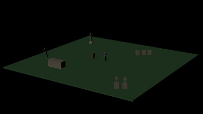
This is quick model of one of the sets that I'll be useing in my per-viz animation. This is the cemetery, as it only appears twice in my animation, along with only being shown as an extreme long shot and used in close ups, it is not as detailed as the other sets would be. I had to use one of the character models so that I could get the scale right and not have to resize everything when I had to record the shots.

From Script To Screen - Per-viz - Set 4

Image
(Left to Right) Spring, Summer, Autumn and Winter A small problem crossed my mind as I was modeling my sets and that was how would I be able to show the different time skips throughout the year in my animation. I did think that I should just leave the sets as their are but the time skips do play a vital role in the story and if I didn't make them clear then their might be lost in the animation along with it becoming confusing. The best way I felt I could get round this problem is to colour the ground differently for each season, each of the colours used would be ones that we would normally associate with each season.

From Script To Screen - Per-viz - Set 3

Image
Normal cottage The cottage on fire This is quick model of one of the sets that I'll be useing in my per-viz animation. This is the outside of the cottage. There are two verisons of this set, the first one is the cottage as it would normally be and the other one is the cottage on fire. I had to use one of the character models so that I could get the scale right and not have to resize everything when I had to record the shots.

From Script To Screen - Per-viz Set 2

Image
This is quick model of one of the sets that I'll be useing in my per-viz animation. This is the outside of the light house. I had to use one of the character models so that I could get the scale right and not have to resize everything when I had to record the shots.

From Script To Screen - Per-viz Set 1

Image
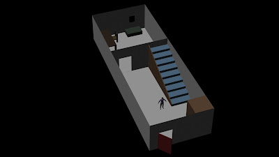
This is quick model of one of the sets that I'll be useing in my per-viz animation. This is the inside of the light house most noticeably the hallway and living room. I had to use one of the character models so that I could get the scale right and not have to resize everything when I had to record the shots.

From Script to Screen - Character Designs - The Daughter (Grown Up)

Image
The daughter grown up This is the main character in my story. She is the Light House Keeper, a role that she took over for her father after his death. She has mostly lived on her own isolating herself from others with the fear that she will loss them like her father.

@Phil - Concept art WIP

Image
This is my concept art for my light house that I'm currently working on, I feel that it's going great but still feel that there is something not right with it. I am still trying to workout how to show the art style that I've choosen in my concept so it does look a little messy in places. I want to try and know where I'm going with this image before I start working on the other concepts properly.

From Script To Screen - Prop Influence Map

Image

Life Drawing - Day 17

Image

Character Workshop - Lesson 5

Image
For this task we were each given a phrase and had to create a story broad for it. The phrase I was given was "The end of days" so I felt that I had to do an apocalyptic scene with aliens. First sketch   First story broad Second story broad

Life Drawing - Day 16

Image

Maya Tutorial - Bouncing Ball On The Spot

Bouncing A Ball On The Spot from Rhia Crouch on Vimeo .

Maya Tutorial - Blend shape and Inbetween

Blend shape and In-betweens test from Rhia Crouch on Vimeo .

From Script To Screen - Storyboard

Image

From Script To Screen - Art Style Influence Map

Image
As my story takes place close to the sea I decided that my art style should to reflect that. This in my mind could mostly come form useing watercolour style textures, I also had the idea that the outlines could be similar to lossely drawn ink paintings. I had the idea that blues, greens and grays would been the main colour scheme for my story, the idea for this came from the colours that we normally think of when it comes to the sea and wild storms. It would also help to show the cold and sadder parts of the animation, I would also off set this with a sepia like tone to help show the warmer parts of the story. For the style of clothing that the characters would ware I thought that the nautical theme should stay with them of obvious reasons. To make it clear that the story take place close to the sea and that some of the characters work in this environment I've chosen to use the classic fisherman's outfit of thick woollen fabrics. The clearest example of this design

Film Review - Psycho

Image
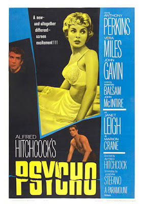
Fig 1. Psycho poster (1960) When we think of Alfred Hitchcock, we think of only one film – Psycho (1960). The film has gone down in history as one of the most perfect pieces of horror cinema even to this day with the way that it twists that story one way and then twists it in another right near the end. Even to this day Psycho has left its mark on popular culture be it the iconic music used or the way that one scene left audiences checking round their shower curtains. The story of the film starts off with the audience following Marion as she steals $40,000, that she said would put in the bank for her boss, with the plan to give it to her boyfriend to clear his debts so they can marry. On her way, she stops off at the Bates Motel and meets Norman Bates, the owner. After a short talk about his mother, who had been seen at the window, Marion gets ready for bed by taking a shower however it soon becomes her own blood that starts to run down the plug hole. With this twist the story

From Script To Screen - OGR 2

From Script To Screen - OGR Part 2 by Rhia Crouch on Scribd

From Script To Screen - Shore Line Influence Map

Image

Maya Tutorial - Non-Linear Deformer

Non-Liner Deformers from Rhia Crouch on Vimeo .

Character Workshop - Lesson 4

Image
In our 4th lesson we were looking at environments and how they can tell a story. We only had one task in this lesson and that was to design an environment based on the two words we were each given, mine were Circus and Intelligent . This task was a real struggle for me as my words don't go together meaning I was stuck for ideas. First drawing Second drawing

Script To Screen - Animation Script

Script to Screen - Script by Rhia Crouch on Scribd

Film Review - Rope

Image
Fig 1. Rope poster (1948) Is it possible to tell a story in one shot or just in one room? Alfred Hitchcock shows that it is with his 1948 film Rope . A film that tried to pull the viewer in without having to break the flow of the camera moving around the set so that the tension could build at a much slower pace but still have the same impact in the end. The story of the film is a basic one but at a sudden turn we are pulled deeper and deeper into it by a new piece of information and are left wondering how this will affect the outcome that we know is coming. Rope tells the story of two men who commit a murder, believing that because they are more intelligent than others they will get away with it, and then hide the body in their apartment while they have a dinner party only a few feet away from the chest it is hidden in. However, the boasting of one of the men leads one of the party guests to becoming suspicious about what they are hiding. One of the ways in which the film pla